- What You'll Learn
- 1. Why aesthetics matter when designing surveys
- 2. Prioritize purpose over prettiness
- 3. Know your survey audience
- 4. Keep your survey design consistent
- 5. Add images that complement the survey
- 6. Understand color psychology
- 7. Choose the right font
- 8. Use white space wisely
- Test Your Knowledge
- Key Takeaways
Get insights.
Unlock value.
- 14-day free trial
- Set up in minutes
- End-to-end encrypted
How to create aesthetic surveys?

- What You'll Learn
- 1. Why aesthetics matter when designing surveys
- 2. Prioritize purpose over prettiness
- 3. Know your survey audience
- 4. Keep your survey design consistent
- 5. Add images that complement the survey
- 6. Understand color psychology
- 7. Choose the right font
- 8. Use white space wisely
- Test Your Knowledge
- Key Takeaways
What You'll Learn
By the end of this lesson, you'll be able to:
- Understand why aesthetics matter in survey design.
- Identify strategies to create aesthetic surveys.
- Increase completion rates for your survey with an aesthetically created design.
1. Why aesthetics matter when designing surveys
Aesthetics shape the user's experience and, in turn, the quality of the data you collect. A well-designed form or survey is more likely to engage users, reduce errors, and increase completion rates.
A visually appealing design encourages users to stay on track and answer accurately. A poorly designed form or survey does the opposite: people get frustrated, abandon it, and the data suffers. When you prioritize aesthetics, you create a user-friendly, intuitive experience that builds trust.
2. Prioritize purpose over prettiness
You might be tempted to use bright colors for your surveys. Or you might reach for a minimalist design instead. Before you touch the survey design, think about its purpose. Put another way, prioritize purpose over prettiness.
Say you are designing a restaurant feedback survey for an upscale fine dining restaurant. Would bright, fancy colors help here? Probably not. In this case, the restaurant feedback survey needs a clean, minimalist, and professional design that fits the affluent customers filling it out.
Here is another example. Now you are running a feedback survey for a casual eatery that is affordable, fun, and lively. Would a minimalist design suit a place built around celebrations? Not really. A feedback survey for a fun, lively casual eatery needs vibrant colors and dynamic elements.
BlockSurvey offers 3 different survey-taking views.
- Classic
- One question at a time
- Conversational
Choose a survey-taking view that matches your purpose.
3. Know your survey audience
Knowing your audience shapes how you design the survey.
A restaurant diner may be young or old, technically adept or a layman, local or foreign, a college student or a working professional. Choose a survey style that suits your audience.
Say your restaurant diner is young. Younger audiences tend to like surveys that are bright and colorful, so a vibrant design is a good fit.
When your restaurant diner is older, the approach changes. Older audiences prefer surveys that are neat and easy to follow. Vibrant colors and dynamic elements can confuse them, so it is better to use a design that is neat, minimalist, and easy to understand.
4. Keep your survey design consistent
You have probably seen social media pages where every post looks different. That inconsistency usually comes from a lack of brand guidelines. The same problem shows up in surveys.
When you create a survey, keep the design consistent from beginning to end. If you don't have brand guidelines yet, consider putting some together. A consistent logo, colors, and fonts are essential. Consistent design raises the respondent's trust in your survey and builds loyalty.
Inconsistent design distracts people and looks unprofessional.
Following your brand guidelines gives your survey a consistent design.
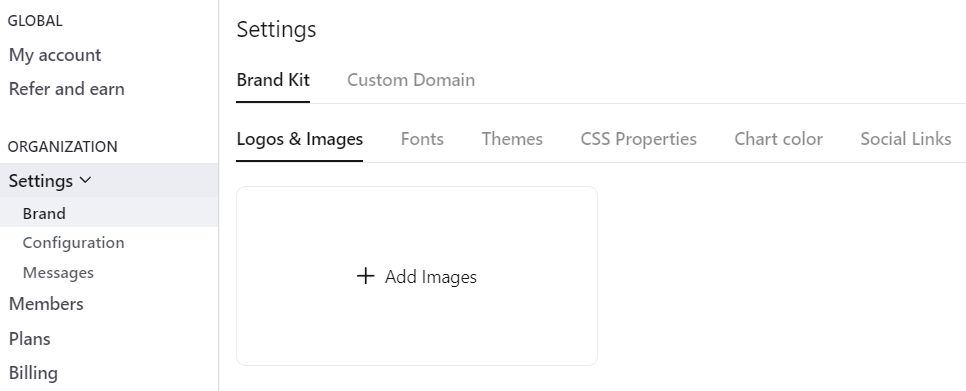
Below is a screenshot of the BlockSurvey Brand Kit.
5. Add images that complement the survey
Images bring a survey to life, but use them thoughtfully. An image should complement the survey, not overwhelm it.
A survey can use scenic photographs, for instance, as long as they don't distract people while they answer.
Browsing image libraries for the right fit takes time. Use a photo editor to align images with your brand guidelines. And before you use any image, make sure you have the right to use it so you avoid copyright issues.
Be prepared upfront and upload images to the BlockSurvey Brand Kit.
6. Understand color psychology
Colors evoke emotions. Using them well matters in fields like marketing, market research, and branding.
Understand the psychology behind colors so you can influence your respondents' mood. Each color carries a subconscious message that affects your respondents' thoughts, moods, and decisions.
For example,
- Blue evokes feelings of trust
- Red induces excitement
- Green evokes feelings of freshness
- Yellow stirs feelings of happiness
Use the right color for your surveys and shape the mood of your respondents.
7. Choose the right font
The font you pick for a survey says a lot. Your font sets the tone for the whole survey.
Start with readability. A readable font lets respondents read your survey clearly and answer accurately.
Take time to choose a font that complements the survey's purpose. Even before reading a question, the respondent sees your font and judges the quality of the survey.
Back to the restaurant example. Decorative or modern fonts can reinforce the aesthetics of a creative, artistic restaurant. Minimalist fonts convey professionalism for an upscale, formal restaurant.
Stick to 2 or 3 fonts at most and keep them easy to read.
8. Use white space wisely
White space is a core part of design and aesthetics, and surveys are no exception.
Enough white space keeps your surveys from looking overwhelming or heavy.
White space is not just empty space. It is breathing room for your content.
White space declutters your survey and makes it more comfortable to read and navigate.
Shorten longer questions, use page breaks, and add sections, all with a balanced use of white space.
Test Your Knowledge
How to create aesthetic surveys? FAQ
What is the importance of creating aesthetic surveys?
How can I design an aesthetically pleasing survey?
Does the design of a survey impact the quality of responses?
Are there any best practices for choosing colors and fonts for surveys?
Can I use images and media in my surveys?
Get insights.
Unlock value.
- 14-day free trial
- Set up in minutes
- End-to-end encrypted
Wilson Bright
Wilson Bright is the co-founder of BlockSurvey, an AI-native, privacy-first survey platform designed to help Institutional Researchers uncover deeper, more actionable insights. He believes the future of Institutional Research lies in combining ethical data collection with intelligent automation to make evidence-based decisions faster, fairer, and more transparent.